Every so often, a trend comes along that makes me rethink how I approach decorating, and right now, it's the turn of 'color capping'.
Coined by the expert team at Benjamin Moore, thisColor trendhas quickly caught the attention of the interiors world. Simply put, it is a tonal technique that flips layering on its head.
"By using paint in varying tones from the same color family, you can completely transform the mood and proportion of a room with this layered approach that draws the eye upward and creates a sense of polish in the space," explains the brand's color expert, Helen Shaw.
If thecolor drenching drenchhadn't already convinced you to ditch the stark white ceiling, andDouble Drenchingorthe sandwich methodhave previously felt too bold, color capping might just be the tonal technique thatfinallychanges your mind.
What is 'color capping'?
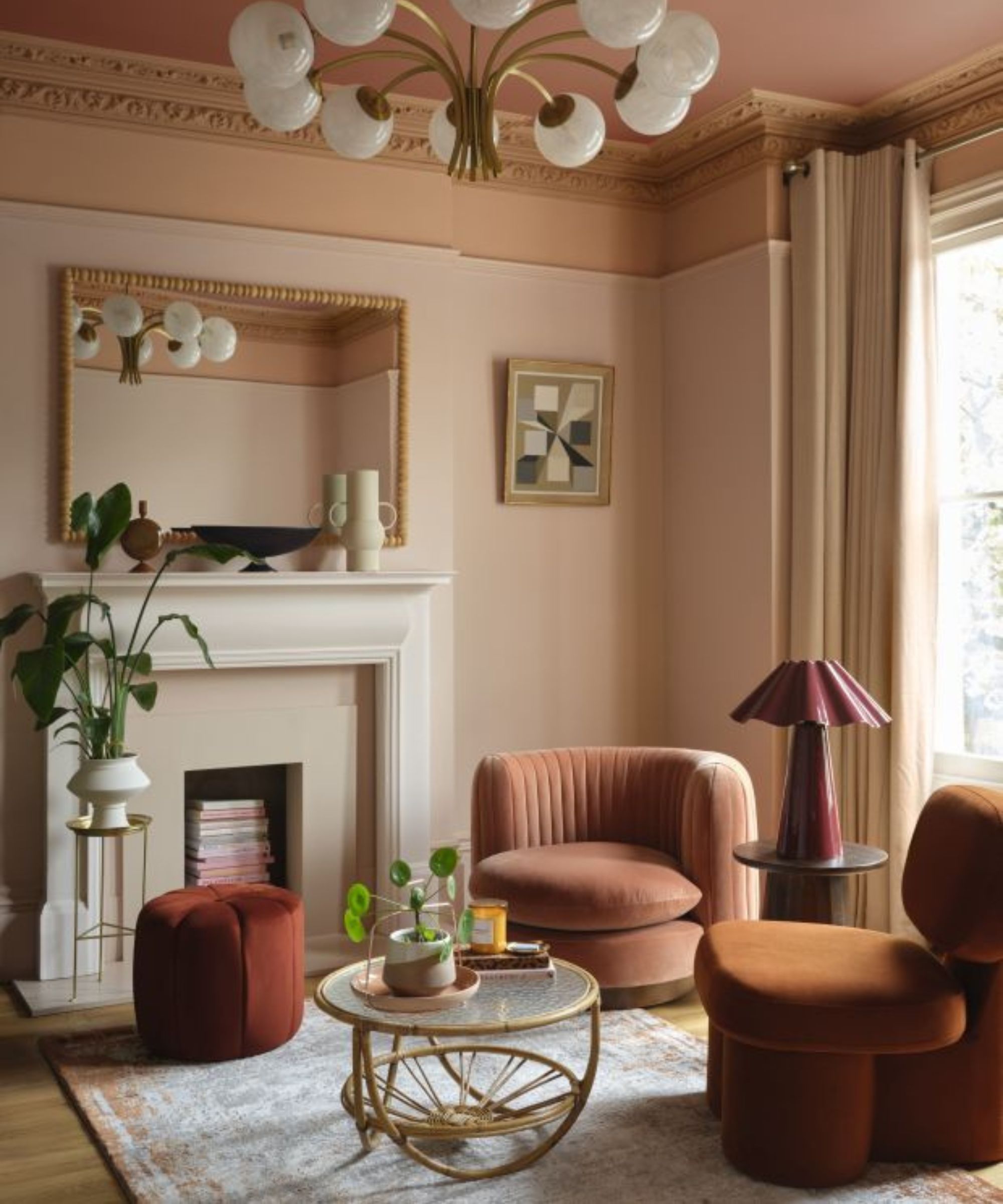
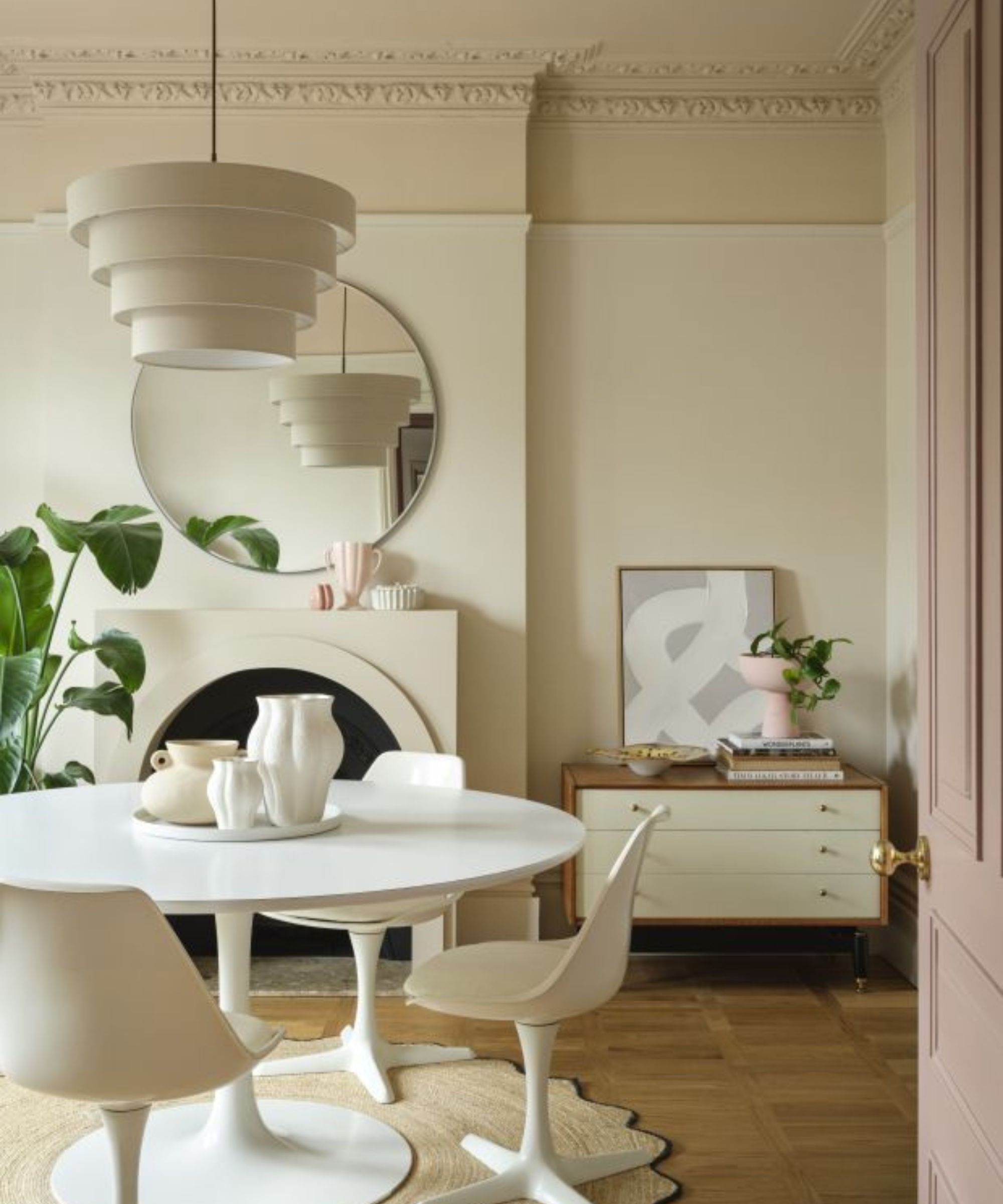
Unlike color drenching, which washes a space in one bold hue, color capping is aColor trendthat works with subtle gradients from the same hue. Think of it like creating an ombre effect with all five walls.
Color capping is a clever way to refresh your home and achieve a high-end look with just a few tins of paint,Benjamin Moore'sHelen explains, "It introduces subtle depth by enveloping the room in a tonal gradient that intensifies toward the ceiling."
The principle is simple: choose two or three tones from the same color family, then apply them in a gentle gradient. Essentially, lighter tones are used across the walls, mid-tones accent the trims or moldings, and the deepest shade "caps" the room at the ceiling, creating anAccent ceilingwithout the harsh contrast.
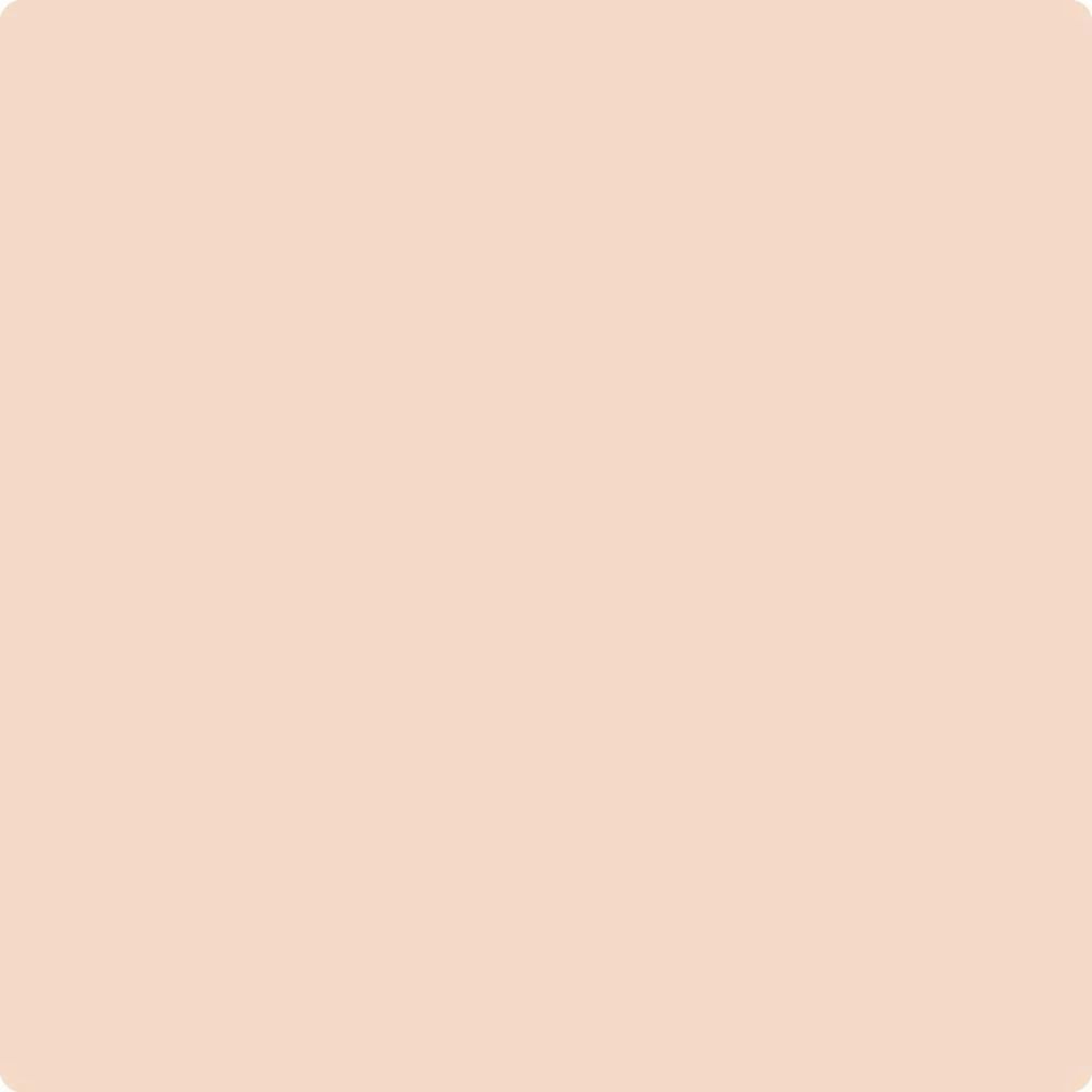
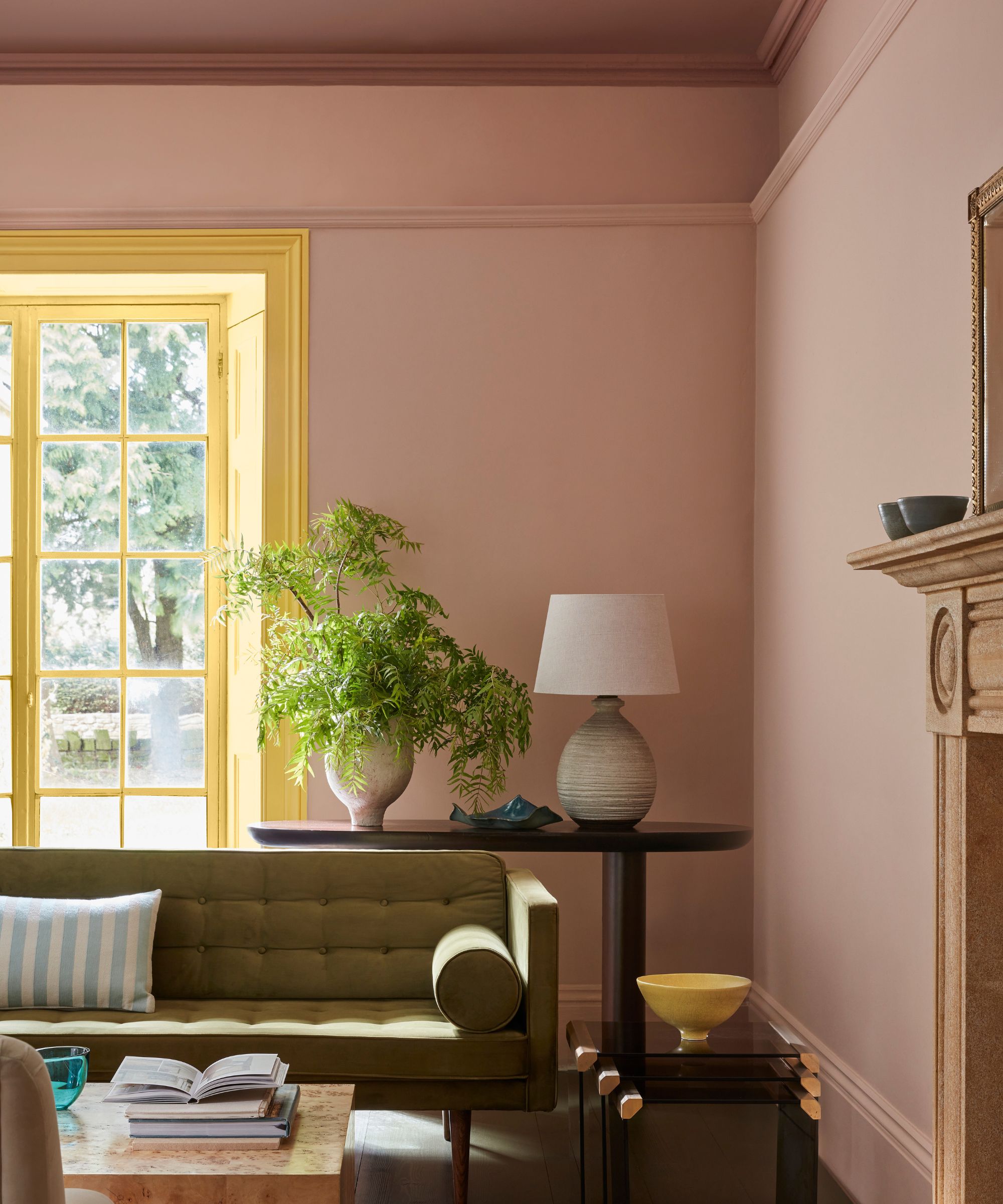
AnUnder-the-radar Benjamin Moore color, Queen Anne Pink is described as a pale peach with 'understated elegance'.
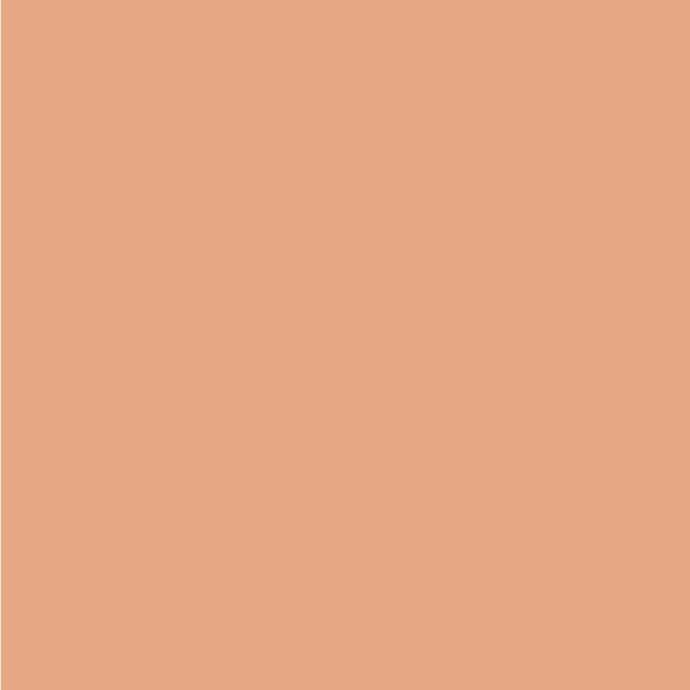
Slightly deeper with more orange undertones than Queen Anne's Pink, Myrtle Beach will help you create a classic beach sunset.
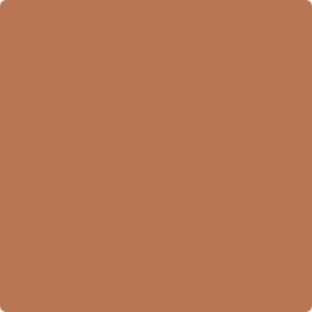
Darker still, Firenze is a Benjamin Moore best-seller and feels like a true orange terracotta hue with an earthy, organic tone.
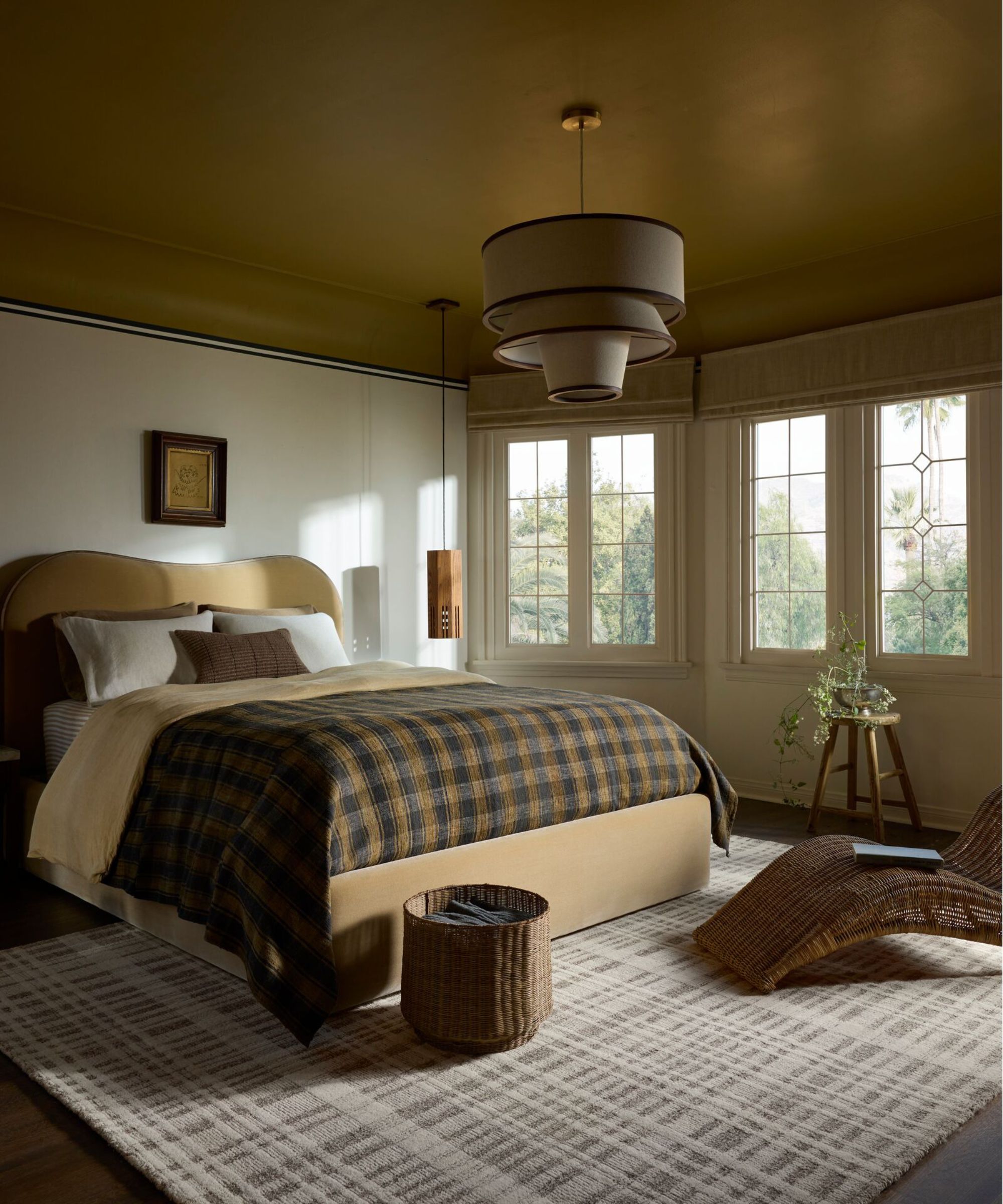
"Think of color capping as a tonal gradient that leads your eye upward," adds the designer.Nina LichtensteinInstead of one flat color, you work with two or three shades from the same color family, getting darker as you approach the ceiling.
The result? A space that reads layered, polished, and dimensional.
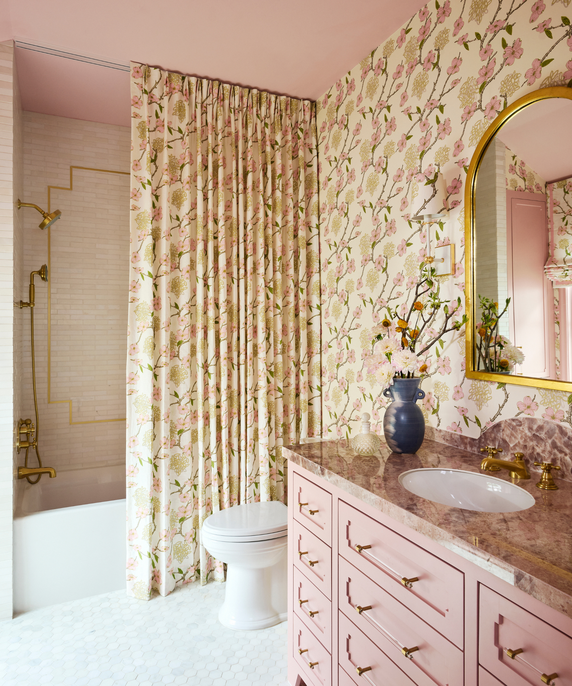
Beyond its super chic finish, thisRoom color ideais a smart tool for playing with space and proportion. "Color capping is a great way to add the illusion of height to a room, particularly in bathrooms where space can be limited or in period homes with decorative features that can be highlighted, like a ceiling cornice," explains Dominic Myland, CEO ofMylands.
Nina agrees, adding that "by visually blending the high parts of the wall into a darker ceiling, the planes feel farther away, which can make rooms read bigger or ceilings feel taller without moving a single beam."
Ruth Mottershead, creative director atLittle Greene, says it works similarly to the double drenching technique, but in a more delicate way. 'It takes the double drenching technique but incorporates tonal shades of the same color, rather than using multiple shades from the same color family with varying undertones,' she explains.
It is essentially the use of 'color scales' to envelop a space, taking colors of different strengths from the same family across all elements, ceilings, walls, and woodwork to drench a space in tonal color.
The transition then feels intentional and harmonious," adds Nina. "Sticking to related hues, or colors that naturally complement each other, keeps the gradient calm, sophisticated, and convincing.
The key to its success lies in the versatility of the technique, no matter if you live in a period home or a more contemporary property.
Helen says: "In older properties, it can highlight architectural features such as cornices and picture rails, whereas in newer or more minimalist spaces, it adds dimension, making flat surfaces feel more dynamic and visually interesting."
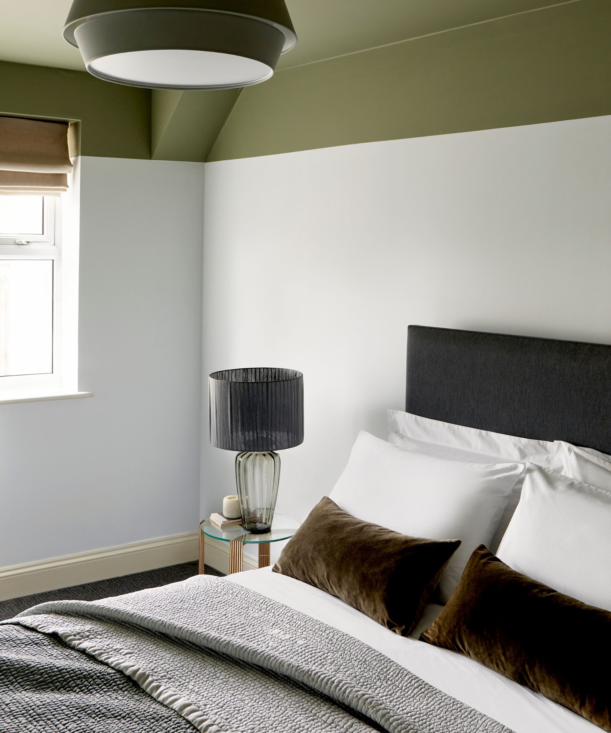
Because it helps with different proportions, color capping works in a wide range of rooms. It can make bathrooms look taller, highlight living room architecture, or create a cocooning effect in bedrooms - all while making the fifth wall part of the design story.
Helen adds that even a small room will benefit, as the layered look instantly 'makes even the most modest room feel considered and as if they've had that 'designer touch'.'
What colors work with color capping?
Removing the guesswork from choosingColor combinations for rooms, this technique lends a helping hand to the color-shy and works beautifully whendecorating with neutralsor more subdued,Quiet Luxury Colorschemes.
Choose shades that share undertones (for example: soft clay for the walls, warmer terracotta for the molding, and a deeper cap overhead," suggests Nina. "If you don't have molding to break the tones, stop the wall color just shy of the top and let the ceiling carry the darkest tone. It's an easy way to build nuance without busy paint tricks, and it works in neutrals just as beautifully as with bolder color; an off-white room can feel subtly elevated when the ceiling shifts only a step or two deeper.
'Color choices can depend on personal preferences, but using tonal colors, such as pairing a natural olive shade likeSerpentinewith an olive shade with yellow undertones likeLondon Plane" gives a subtle sense of cohesion," Dominic adds.

Decorating with Benjamin Moore's Swiss Coffeecouldn't be simpler, it's warm, goes with everything but is perfectly neutral too.

One of the bestBenjamin Moore paints for creating a cozy living room, Fossil is a true versatile beige.
Slightly darker and pinker than Fossil, Baby Fawn is one of thebest Benjamin Moore paint colors for a bedroomaccording to designers.
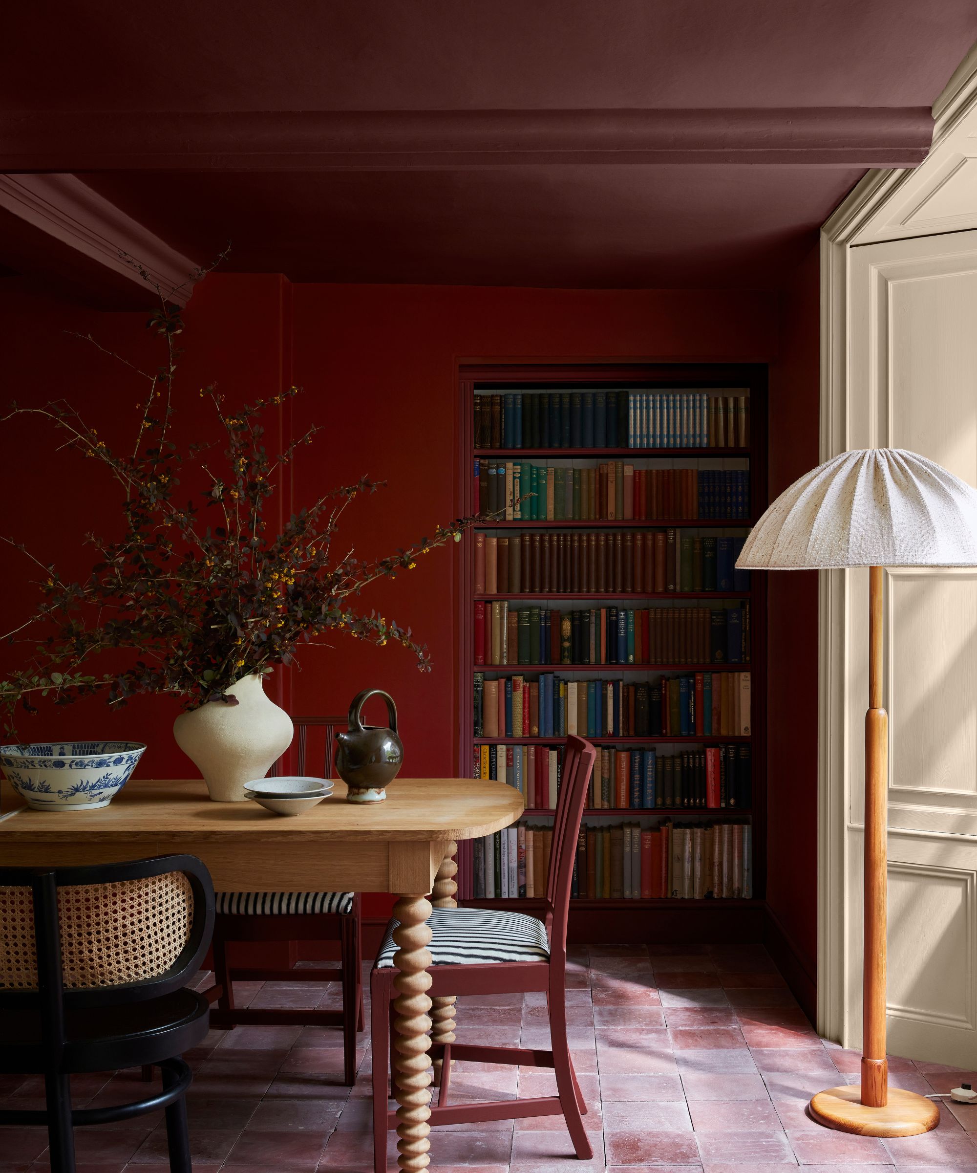
That said, color capping also has room for bolder interpretations.Jewel tones, earthypinks, orgreen room ideascan create drama and dimension, especially when graduated from light to dark.
"We offer a range of colors that have been designed to work in combination in this way, using graduated tones made using the same pigments, but in different strengths, allowing for the creation of a harmonious design scheme that provides movement within a space," says Ruth.
These tones are easy to use in combination on walls, ceiling, and trim as well as providing a seamless color journey from room to room," she adds. "For something bolder, you can highlight architectural features or areas of interest by using vibrant, contrasting colors likeTuscan RedorBronze RedalongsideMasqueradeto add drama to a space.
"Whether you choose soft neutrals or rich jewel tones, color capping brings a layered sophistication to any space," adds Helen.
Finally, the most successful "color-capped" schemes are those that don't stop at the ceiling line. Try to echo your palette in the textiles, window treatments, and upholstery in the room to ensure the space feels cohesive from floor to ceiling.
Color capping may be new on the scene, but it feels like one of those trends destined to stick around. Simple enough for even the most color-adverse decorators, yet versatile enough to bring depth and drama to statement schemes, and with Benjamin Moore leading the way, could this layered paint technique be one of fall's most defining new looks?
Like this article? For more stories like this, follow us on MSN by clicking the +Follow button at the top of this page.
0 comments:
Ikutan Komentar